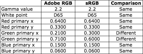
Two of the most commonly used ICC profiles for RGB images are Adobe RGB (1998) and sRGB IEC61966-2.1. The Adobe RGB (1998) color space has a larger color gamut than the sRGB IEC61966-2.1 color space, but you may be surprised to see that they share many similarities.
In order to compare the two color spaces, I will use the CIE and ICC data that define the color spaces:
- Gamma value
- White point
- Red primary CIE chromaticity coordinates
- Green primary CIE chromaticity coordinates
- Blue primary CIE chromaticity coordinates

As you can see in the table, Adobe RGB (1998) and sRGB IEC61966-2.1 share the same values for four of the five attributes. The only difference is the set of CIE chromaticity coordinates for the green primary.
Now let me show you two versions of a sample image. For the first image, the sRGB IEC61966-2.1 ICC profile was assigned to the image in Adobe Photoshop. For the second image, the Adobe RGB (1998) ICC profile was assigned to the image in Adobe Photoshop. (Note: To make sure you see a difference between the two images, I converted the second image from Adobe RGB (1998) to sRGB IEC61966-2.1 so that both images are coded to the same color space. Yes, I could have coded both of them in the Adobe RGB (1998) color space to make sure no colors got clipped. Feel free to repeat this experiment in a color-managed display environment to see the color differences.)
sRGB IEC61966-2.1 ICC Profile

Adobe RGB (1998) ICC Profile

As you can see, the colors in the image with the sRGB IEC61966-2.1 ICC profile are significantly different from the colors in the image with the Adobe RGB (1998) ICC profile.
Based on the data comparison above, I would have expected the reds and blues to be similar in both images, and I would have expected the greens to be very different. However, the greens and blues have small shifts in color, and the reds and oranges have large shifts in color. Here is another set of images that demonstrates the color differences.
sRGB IEC61966-2.1 ICC Profile

Adobe RGB (1998) ICC Profile

Why do we see these large color differences in the reds and oranges when the only difference in the two color spaces is the set of CIE chromaticity coordinates for the green primary? The answer can be found in the CIE XYZ tristimulus values for the red, green, and blue primaries.
sRGB IEC61966-2.1 CIE XYZ Tristimulus Values

Adobe RGB (1998) CIE XYZ Tristimulus Values

The two color spaces share the same CIE chromaticity coordinates for the red and blue primaries, and share the same D65 white point and 2.2 gamma value, but the two sets of CIE XYZ tristimulus values are completely different.
To fully understand the differences when the images are viewed with proper color management, we have to look at the 3×3 matrix in the ICC profile. As I described in an earlier post, a chromatic adaptation transform must be applied to the CIE XYZ tristimulus values to force the 3×3 matrix to deliver the D50 white point that is required in the specification for ICC profiles. For the Adobe RGB (1998) and sRGB IEC61966-2.1 ICC profiles, the Bradford transform and proper von Kries scaling were used to move the white point from D65 to D50. The CIE XYZ tristimulus values in the 3×3 matrices are shown below.
sRGB IEC61966-2.1 ICC Profile 3×3 Matrix

Adobe RGB (1998) ICC Profile 3×3 Matrix

The CIE XYZ tristimulus values in these two 3×3 matrices help explain the color shifts seen in the two sets of example images. Further analysis can be done with these two matrices to compare the CIELAB values associated with a given set of RGB pixel values.
The point of this post is to alert people to be careful when comparing color spaces in color managed workflows. It is convenient to compare RGB color spaces based on the CIE chromaticity coordinates of the primaries, but it is difficult to predict the color differences in color-managed images from a comparison of CIE chromaticity coordinates of the primaries.
Post written by Parker Plaisted
References:
International Color Consortium, ICC Profile Format Specification, http://www.color.org
M. Fairchild, Color Appearance Models, Addison-Wesley, Reading, Massachusetts (1998).
Bruce Lindbloom Website, RGB Working Space Information page, http://www.brucelindbloom.com

I have an imac i7 and when I read the srgb profile it gives me the white point values for d65 but gives me the rgb (xyz) tristimulus values found for a d50 white point. Do you know why this is?
Bryce, The best way for me to answer your question is to point you to a post on my blog: https://color-image.com/2012/04/chromatic-adaptation-for-display-profiles/
The D50 CIE tristimulus values are required by the ICC for the profile connection space. All color-space profiles (e.g., sRGB), regardless of the actual white point of the color space (e.g., D65), must use D50 for the profile connection space.
For those less mathematically inclined a way to explain it is that the green component in Adobe RGB is considerably more saturated and forces higher intensities of both the blue and red in order not to shift the white point which is the same in both spaces at (255,255,255)/